
Artwork labels can feel like one of the less exciting parts of preparing for an exhibition, but they play an important role in how people experience your work.
As a curator, I think about labels as a bridge between the artwork and the person standing in front of it. They can give someone context, answer the practical questions they might feel awkward asking and, if the work is for sale, make it clear what they can do next.
They also do not need to be complicated. In most cases, a good artwork label is simple, consistent and easy to read.
This guide covers what to include on artwork labels, how to format and display them, what changes when your work is for sale and some templates you can adapt for your own exhibitions.
What Should an Artwork Label Include?
For most exhibitions, an artwork label should include:
- Artist name
- Artwork title
- Year
- Medium
- Dimensions
Depending on the exhibition, you might also include the price, edition information, a short description or a way to find out more about the work.
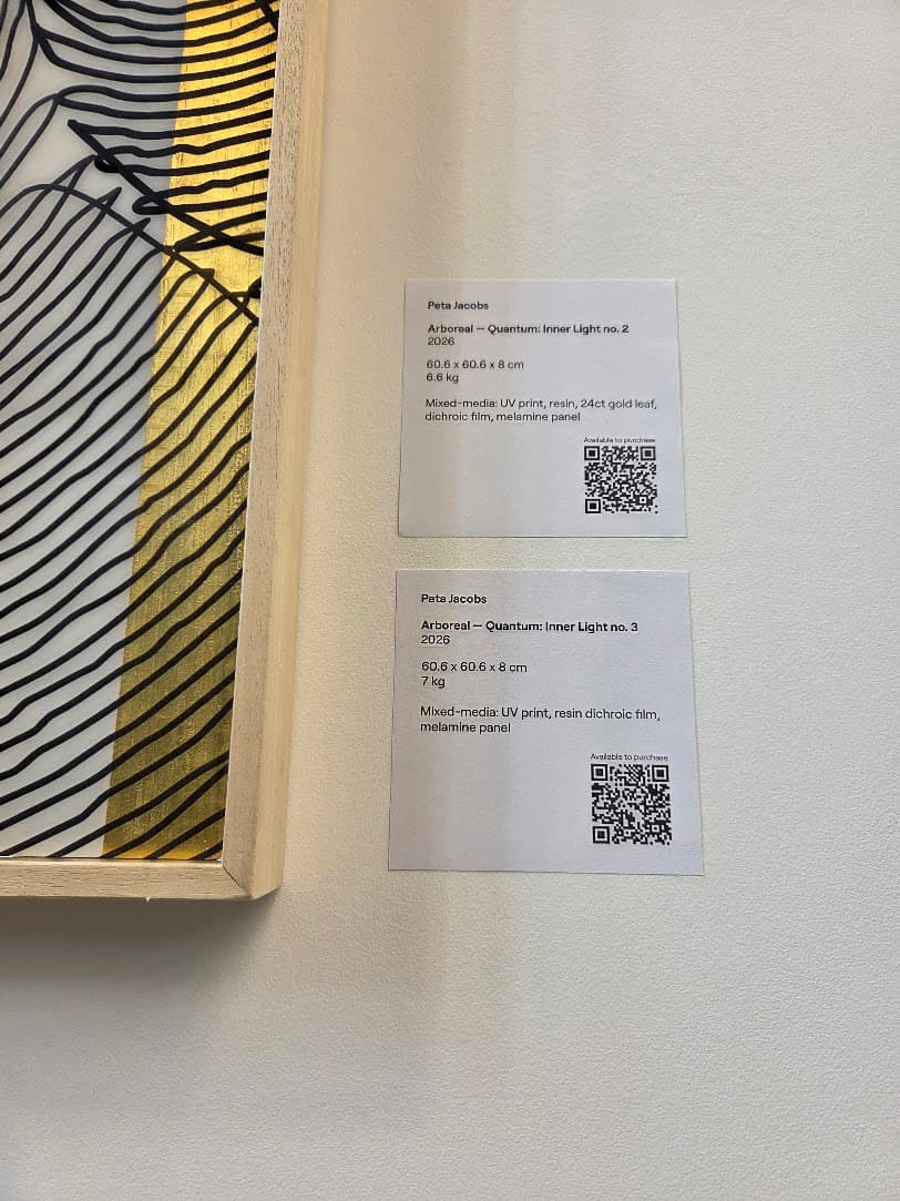
A basic artwork label example might look like this:
Olivia Abando
Untitled, 2026
Oil and mixed media on canvas
60 × 80 cm
There is no single universal format. A gallery, museum, art fair or exhibition organiser may have its own requirements, so always check before producing your labels.
What matters most is consistency. If you are showing ten works, somebody should not have to decipher ten different systems to understand them.
Artwork Label Template
If you are creating your own exhibition, this simple artwork label template is a good starting point:
[Artist name]
[Artwork title], [Year]
[Medium]
[Dimensions]
[Edition, if relevant]
[Price or availability, if relevant]
For example:
Jane Smith
After the Rain, 2026
Acrylic and oil pastel on canvas
70 × 50 cm
£850
For an edition:
Jane Smith
Blue Hour, 2026
Archival pigment print
42 × 59.4 cm
Edition of 20
You can adapt this depending on the context. The important thing is that every addition has a reason for being there.
Should You Include an Artwork Description?
Sometimes.
Not every artwork needs a paragraph beside it. In fact, too much information can compete with the work rather than help people engage with it.
I usually ask: what does the viewer genuinely need to know here?
For some work, the title, medium and date are enough. For others, knowing something about the process, materials, location or wider body of work can completely change how you encounter it.
If you do include additional text, keep it concise. You are giving someone another route into the work, not telling them what they are supposed to think about it.
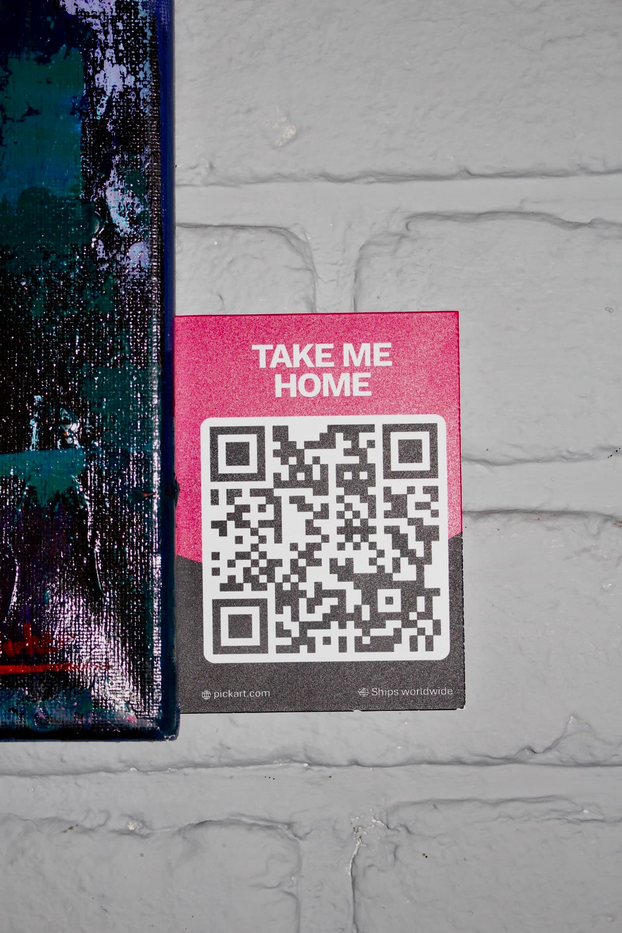
If there is more context you want to share without overcrowding the wall, a QR code can be a useful extension of the label, giving viewers the option to explore additional information without it competing with the work itself.
For exhibitions with a wider curatorial theme, it can also make more sense to have an introductory exhibition text and keep individual artwork labels relatively simple.
How to Make Exhibition Labels
Once you know what information you need, the presentation is mostly about making it unobtrusive and readable.
You do not need elaborate graphic design. Choose a clear typeface, create a consistent hierarchy and make sure the text is large enough to read comfortably without having to get extremely close to the wall.
Keep the same formatting across the exhibition. Titles might be italicised, for example, while artist names remain in regular or bold text.
Labels can be professionally printed, printed onto card or mounted onto foam board or another suitable material. The right choice depends on the space, budget and duration of the exhibition.
For a temporary independent show, a beautifully typeset card label may be completely appropriate. A practical hack I use is printable sticky address or postage labels. You can buy sheets that go straight through a standard printer, set up one consistent label template and print a whole exhibition at once. They're inexpensive, quick and particularly useful for temporary exhibitions or events where you don't need permanent signage. Just make sure the adhesive is suitable for the surface you're using, and avoid sticking them directly onto delicate or painted walls without checking first.
For a longer-term hospitality placement, you may want something more durable.
Always consider the venue itself too. A label that works on a white gallery wall might feel completely different in a restaurant, hotel or café.
At PickArt, much of our work involves placing contemporary art in spaces outside traditional galleries, so we are constantly thinking about how artwork information can sit naturally within an environment rather than making the space suddenly feel like an exhibition hall. If you're considering showing your work in these kinds of spaces, we explore the practicalities in Can I Exhibit My Art Without a Gallery?
Where Should Artwork Labels Go?
The conventional position is beside the artwork, usually at a comfortable viewing height and with enough space that it clearly belongs to that piece.
But context matters more than following a rule for the sake of it.
If you are installing in an unusual space, look at how people naturally move through it. You do not want somebody standing in a doorway to read a label, or a restaurant guest having to lean over another person's table.
This becomes particularly important when artists are exhibiting and selling work in cafés, restaurants and other hospitality spaces, where labels need to work around the way people naturally use the space. If you're thinking about showing your work in these settings, we go into more detail on approaching venues, displaying work and managing sales in How to Sell Art in Cafés and Restaurants.
Whatever position you choose, make the relationship between artwork and label obvious.
Should Artwork Labels Include Prices?
This depends on the context, but if the purpose of the exhibition includes selling work, I generally favour making the buying process clear.
That does not necessarily mean every exhibition needs a large price printed beside every artwork.
You could:
- Put the price directly on the label
- Use a separate price list
- Mark works as available and provide purchasing information
- Use a QR code that leads to the artwork information and price
What I would avoid is making somebody work unnecessarily hard to find out whether something is available.
There can still be an assumption that asking about the price of art is somehow embarrassing, or that if you have to ask, you probably cannot afford it. I think that is one of many small things that can make collecting art feel more intimidating than it needs to be.
Clear information helps remove that barrier.
If pricing itself is something you are working through, we have a separate guide: Why Pricing Your Art Feels So Difficult.
Using QR Codes on Artwork Labels
QR codes can be particularly useful when there is more information than you reasonably want to put on the wall. Often, that additional context is really important to both the artist and the audience, but including everything physically can overwhelm the label and distract from the work itself.
A QR code could lead someone to:
- More information about the artwork
- The artist's profile and story
- Additional images or details
- Price and availability
- A way to purchase the work
The important thing is that the QR code should add to the label, rather than replace the basics.
The amount of information you include physically can depend on the context. In most exhibition settings, it is helpful to keep the essential details, such as the artist's name and artwork title, visible on the physical label, using a QR code to provide additional context without overcrowding the wall. In some more informal or design-led spaces, a more minimal QR-led approach with a clear call to action can also work, particularly where keeping the display visually unobtrusive is important.
This is also where the physical and digital experience can work particularly well together. Someone discovers a work because they encounter it in real life, then uses the QR code when they actively want to know more.
Making Artwork Easier to Buy
For independent artists, the bigger question is often not just what goes on my label? but what happens when somebody wants the work?
You might already be exhibiting through Open Studios, art fairs, cafés, restaurants, group shows or exhibitions you have organised yourself. In those situations, you have done the difficult work of getting the artwork in front of people. The next step is making sure interest does not disappear because the purchasing process is unclear.
You can absolutely manage this yourself. You might link to your website, provide contact details or direct people to an online shop.
We built PickArt Indie as another option for artists who are already creating their own opportunities.
Artists can create digital pages for their physical artworks and use QR labels to connect viewers to the artwork details, artist profile, pricing and checkout. It means somebody can encounter your work in person and, if they want to take the next step, there is a straightforward route to do so.
For example, when PickArt artist Peta Jacobs exhibited work at Science Creates, the venue incorporated PickArt QR codes into its own labels. I like this example because the technology did not need to dominate the display. It simply sat within the exhibition's existing visual language and gave interested viewers somewhere to go next.
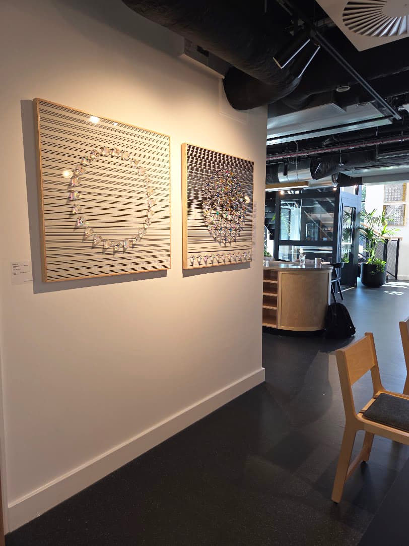
The aim is not to turn every interaction with art into a transaction. It is to make sure that when somebody does fall in love with something, buying it does not become unnecessarily difficult. PickArt Indie is one way of creating that bridge between seeing a work in person and being able to learn more about it or buy it easily.
If you're preparing for an exhibition, Open Studio or art fair, we cover more of the practical side of turning in-person interest into sales in How to Sell Art in Person: Open Studios, Exhibitions and Art Fairs.
What Should You Avoid on an Artwork Label?
The biggest mistake is usually trying to make the label do too much.
Avoid overcrowding it with a full biography, long explanation, multiple links, social handles and every possible piece of information about the artwork.
I would also avoid:
Tiny text. If people have to lean into the wall to read it, it is too small.
Inconsistent formatting. Decide on your format before printing everything.
Unclear availability. If works are for sale, give people a clear way to find that information.
A QR code with no explanation. Tell people what they will find when they scan it.
Poor placement. Think about sightlines, accessibility and how people actually use the space.
And finally, proofread everything. Artwork titles, dates, dimensions and prices are exactly the sort of details that are easy to stop seeing after you have looked at them twenty times.
A Simple Exhibition Label Checklist
Before you print your labels, check:
- Is the artist's name correct?
- Is the artwork title correct?
- Have you included the year, medium and dimensions?
- Is edition information included where relevant?
- Can the text be read comfortably?
- Is every label formatted consistently?
- If the artwork is for sale, is it obvious how someone can find the price or buy it?
- Does any QR code work on multiple phones?
- Have you checked the organiser or venue's requirements?
The Best Artwork Labels Make Things Easier
Ultimately, artwork labels are there to help people engage with art.
They do not need to prove how serious an exhibition is, and they do not need to explain every decision the artist has made. They need to give people the information they need and, ideally, make them feel comfortable discovering more.
That matters particularly to me because demystifying art is a big part of my curatorial practice. I believe people should be able to encounter contemporary art without feeling that there is a set of rules or knowledge they were somehow supposed to arrive with.
A thoughtful label is a very small part of that, but small points of accessibility add up.
And if you are exhibiting independently, think one step beyond the label too: if somebody standing in front of your work loves it, have you made it obvious what they can do next?
For me, good artwork labels are ultimately part of making art feel more accessible. Clear information gives people a way into the work, helping to demystify an experience that can sometimes feel intimidating or overly formal.
The takeaway is simple: give people the information they need to connect with the work, without letting the label compete with the artwork itself.
If you're thinking beyond the label to how people discover and buy your work, we explore the different options in Instagram, Etsy or QR Codes? The Best Ways to Sell Art Online and How to Sell Art in Person: Open Studios, Exhibitions and Art Fairs. Or, if you already have somewhere to show your work and want to make the journey from discovery to purchase simpler, PickArt Indie can provide the QR and digital sales layer to support it.